Adjust Text Area, Text Color, and Background in Card Maker
Move and resize the text box on your card, change the text colour, swap the background — and what to do when a message will not fit.
The defaults produce a usable card straight away. These controls are for the times they do not quite — the text sitting over the busiest part of the background, a colour that fights the image, or a message longer than the space it was given.
Inside Image Studio the control bar has three buttons — Design, Background and Text style — and text colour and the text-area resets live under Text style. Every change shows in the preview immediately.
Move and resize the text area
The text area is the box your words sit in, and it is editable directly on the preview. There is no panel to open first:
- Drag the box to move it.
- Drag a handle on an edge or corner to resize it.
Each handle is labelled by position, so this works with a keyboard and a screen reader as well as with a mouse.
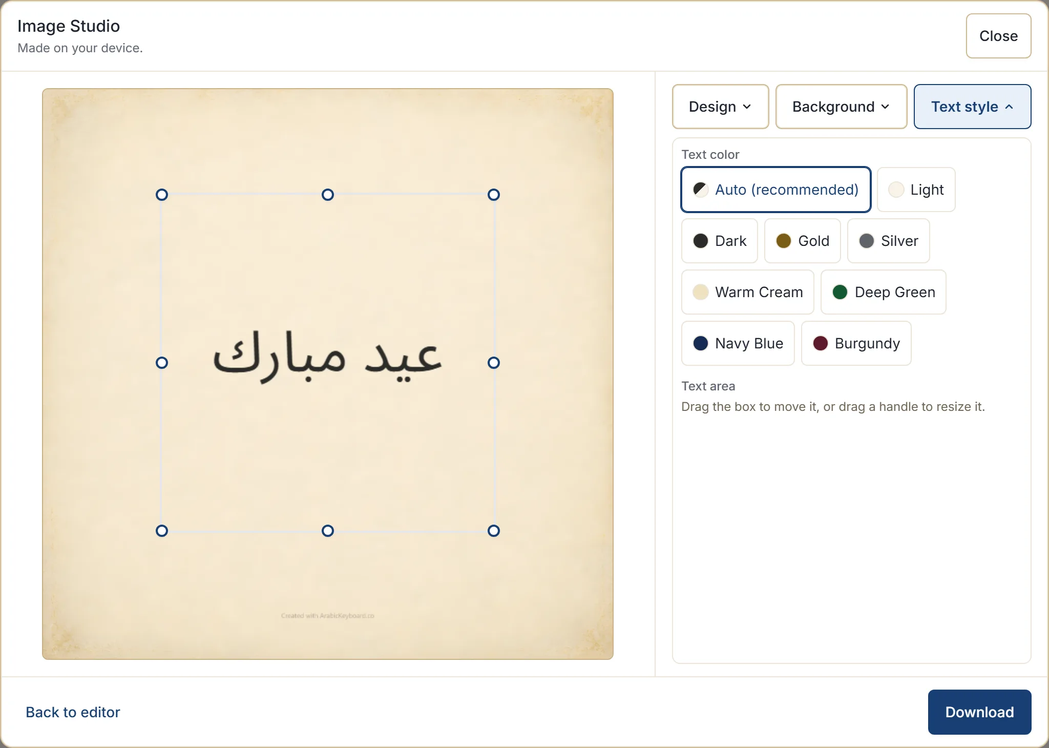
Two resets are there when you have moved things too far, under Text style: Reset position puts the box back where the design intended, and Reset size restores its original dimensions.
Some designs have parts where text does not belong — a decorative border, a dense pattern. If you drag the box somewhere it cannot go, it moves back to the last valid position and tells you why rather than silently allowing it.
Change the text colour
Under Text style, text colour is set to Auto (recommended) by default, which picks light or dark to suit the background you are on. That is the right answer most of the time, and it re-decides when you change background.
Where you want something specific, the options are Light, Dark, Gold, Silver, Warm Cream, Deep Green, Navy Blue, and Burgundy — with Reset returning you to Auto.
Gold and silver suit formal and celebratory cards. The deeper tones — green, navy, burgundy — work on light backgrounds and can look considered where plain dark would look flat. On a busy background, plain light or dark is usually more readable than any of them.
Swap the background
Each design ships with several backgrounds in the same style. Background switches between them.
This is the control to reach for first when a card is nearly right. It changes the feel — lighter or darker, busier or calmer — without changing the design’s character, and it often solves a readability problem on its own.
When the message will not fit
The studio will not squeeze text until it is unreadable. If a message cannot be laid out in the space available, it says so and offers the three things that actually help:
- Give the text more space — enlarge the text area, which is usually the answer.
- Shorten the message — a card is read at a glance, and long text rarely improves one.
- Choose another design — some designs leave more room for words than others.
If the text area itself is too small for the message, the studio names that specifically and suggests enlarging or resetting it.
Practically: try enlarging the box first, and if the card still looks crowded, the message is probably too long for a card rather than the card being too small for the message.
Editing the words
Back to editor returns you to the typing box with your text as you left it. Change it, then open the studio again — your design, background, and colour choices are still set.
That round trip is the normal way to work. Nothing is lost in either direction.
What is remembered
Your design, background, size and text colour choices are saved on that device so the next card starts where you left off. They are stored in that browser only, along with your other preferences.
What is not stored is your message. The preferences record how a card should look, not what it said.
Next step
Open the Arabic keyboard, make a card, and drag the text area to a different part of the background — seeing the preview follow makes the rest of these controls obvious. If the card is not working at all, choosing a card design is the better place to start than fine-tuning.